widgets Package
- Widgets:
- Simple: Simple widget that does nothing. May be useful for images etc.Button: Clickable button.Combo: Combo box.FPSCounter: FPS counter.InputBox: Input box.Label: Label.Menu: Game menu.Radio: Radio button.settings: TODO (Stay away). Common user settings (keymap etc.)Scale: Scale slider.Switch: Switch widget.
- Container widgets:
- Composite widgets:
- DialogSaveQuit: Dialog asking the user if they want to save their work when quitting.
Core Widgets
base_widget Module
Base widget, all widgets inherit from this.
- class Simple(surf=None, flags=None, **kwargs)
Bases: pygame.sprite.Sprite
Widget foundations all widgets should inherit from. This can also be used as a simple widget that does nothing, such as displaying an image.
- Attributes:
- image: The current surface that will be drawn to the screen.rect: The pygame.Rect used for the widget’s position and size.rect_abs: A pygame.Rect using the absolute screen position.pos: The widget’s position. Can be retrieved or assigned as a shortcutfor rect.topleft. Also a shortcut for setting pos through config().pos_abs: The widget’s absolute screen position.
- Args:
- surf: The surface that should be drawn to screen, of type:pygame.Surface: Use an existing surface.tuple,list: Contains size as (width,height), creates a new surface.str: Contains file name to load an image.dict: Contains multiple images to be loaded. The documentation willspecify if a widget uses multiple images and what names to use.flags: Override the flags passed to pygame.surface.Surface.kwargs: Any number of keyword arguments matching those for config().
- config(**kwargs)
Update widget configuration and redraw the widget.
- Keyword Args:
- pos: tuple (x,y) Position to set widget to.label: str Text to display next to widget.label_side: str (“top”, “right”, “bottom”, “left”)Which side of the widget to display the label.
- add(order=None, fade=True, focus=False)
Add widget to screen.
- Args:
- order: Integer representing the order widget should receive focuswhen user presses TAB. The widget with the lowest order willreceive focus first, then moving up with increasing values.fade: True if widget should fade in, False if not.focus: To focus widget immediately, use 1 if focused by keyboard,2 if by mouse, otherwise 0.
- remove(fade=True)
Remove widget from screen.
- Args:
- fade: True if widget should fade out.
- active()
Return True if widget is active (onscreen).
- has_focus()
Return True if this widget has focus.
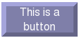
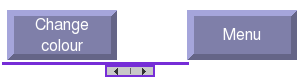
button Module
Button widget, allows input from the user clicking the button.
Bases: sgc.widgets.base_widget.Simple
A clickable button.
- Images:
- ‘image’: The default button state.‘over’: The image used when the cursor is hovering over the button.‘down’: The image used when the user is clicking down on the button.
Update widget configuration and redraw the widget.
- Keyword Args:
- pos: tuple (x,y) Position to set widget to.label: str Text to display on the button.col: tuple (r,g,b) The central colour used if no image isprovided. If you want to avoid the colours saturating keep theRGB values below 200.label_col: tuple (r,g,b) The text colour for the button’s label.label_font: Font object for label.
Called when the button is clicked through either mouse or keyboard.
Emits an event with attribute ‘gui_type’ == “click”.
Override this function to use as a callback handler.
combo Module
Combo box widget, allows the user to choose an option from a selection.
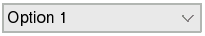
- class Combo(surf=None, flags=None, **kwargs)
Bases: sgc.widgets.base_widget.Simple
A combo box.
- Attributes:
- selection: int Set or retrieve index of current selection.
- config(**kwargs)
Update widget configuration and redraw the widget.
- Keyword Args:
- pos: tuple (x,y) Position to set widget to.label: str Text to display next to widget.label_side: str (“top”, “right”, “bottom”, “left”)Which side of the widget to display the label.selection: Index of current selection, None if none selected.values: Sequence of strings to allow the user to select from.
- on_select()
Called when the selection is changed.
Emits an event with attribute ‘gui_type’ == “select”, ‘selection’ == index of selection made and ‘value’ == value of selection made.
Override this function to use as a callback handler.
fps_counter Module
FPS counter, display current FPS performance to the user.

- class FPSCounter(surf=None, flags=None, **kwargs)
Bases: sgc.widgets.base_widget.Simple
FPS counter
- config(**kwargs)
Update widget configuration and redraw the widget.
- Keyword Args:
- pos: tuple (x,y) Position to set widget to.clock: pygame.time.Clock Clock used to time the game loop.label: str Text to display in front of the value.
- toggle()
Toggle the FPS counter, adding or removing this widget.
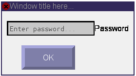
input_box Module
Input Box for receiving text input.
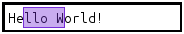
- class InputBox(surf=None, flags=None, **kwargs)
Bases: sgc.widgets.base_widget.Simple, sgc.widgets._interface.text.SelectableText
Input box
- Attributes:
- text: Text entered in input box. Can be set or retrieved directly.
- Images:
- ‘image’: The background of the input box when focused.‘inactive’: The background of the input box when not focused.
- config(**kwargs)
Update widget configuration and redraw the widget.
- Keyword Args:
- pos: tuple (x,y) Position to set widget to.label: str Text to display next to widget.label_side: str (“top”, “right”, “bottom”, “left”)Which side of the widget to display the label.default: str Contains the default text displayed when nothinghas been entered and input box does not have focus.blink_interval: int Milliseconds between cursor blink.col_focus: tuple (r,g,b) Background colour when focused.col_focus_not: tuple (r,g,b) Background colour when not focused.col_selection: tuple (r,g,b) Colour of selection rectangle.max_chars: int Maximum number of characters.repeat_begin: int Milliseconds key is held down before repeating.repeat_interval: int Milliseconds between key repeats.text: str Set the text entered in input box.
- on_enter()
Called when the user hits the enter key.
Emits an event with attribute ‘gui_type’ == “enter” and ‘text’ with the text entered.
Override this function to use as a callback handler.
label Module
Label to display information to the user.
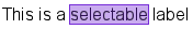
- class Label(surf=None, flags=None, **kwargs)
Bases: sgc.widgets.base_widget.Simple, sgc.widgets._interface.text.SelectableText
Label
- Attributes:
- text: str displayed in label. Can be assigned as a shortcut forconfig(text=) with no second paramenter.
- config(**kwargs)
Update widget configuration and redraw the widget.
- Keyword Args:
- pos: tuple (x,y) Position to set widget to.label: str Text to display next to widget.label_side: str (“top”, “right”, “bottom”, “left”)Which side of the widget to display the label.text: Either str containing text to be displayed ortuple containing two strings. First string is text tobe displayed, second string is rect attribute to be usedfor position. Defaults to ‘topleft’ if not passing a tuple.col: tuple (r,g,b) Text colour.font: Font object the label will render with.selectable: bool True if the text should be selectable.col_selection: tuple (r,g,b) Colour of selection rectangle.repeat_begin: int Milliseconds key is held down before repeating.repeat_interval: int Milliseconds between key repeats.
radio_button Module
Radio Button, allows the user to select a single option from a group.

Bases: sgc.widgets.base_widget.Simple
A selectable radio button.
- Attributes:
- radio_groups: A dictionary containing the active radio button or Nonefor each radio group. Key is str containing the name of the group.selected: True if widget is the currently selected radio button init’s group.
- Images:
- ‘image’: The default, inactive button state.‘over’: The image used when the cursor is hovering over the button.‘active’: The image used for the active button in a group(if applicable).
Update widget configuration and redraw the widget.
- Keyword Args:
- pos: tuple (x,y) Position to set widget to.label: str Text to display next to widget.label_side: str (“top”, “right”, “bottom”, “left”)Which side of the widget to display the label.group: str Name of the group for widget to be added to.active: True Makes this the active radio button for it’s group.col: tuple (r,g,b) The colour to be used for the ‘over’ imageif not using a custom image.
Called when the radio button is selected.
Emits an event with attribute ‘gui_type’ == “select”.
Override this function to use as a callback handler.
Clear a group so no radio button is selected.
- Args:
- group: str Group name to clear. Clear this widget’s group if None.
scale Module
Scale widget, allows the user to select a value along a scale using a slider.
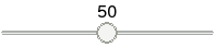
- class Scale(surf=None, flags=None, **kwargs)
Bases: sgc.widgets.base_widget.Simple
A scale slider.
- Attributes:
- value: Set and retrieve the value the slider is currently set to.
- Images:
- ‘image’: The default button state.‘handle’: The slider handle.‘handle_drag’: The slider handle when the mouse is held down.
- config(**kwargs)
Update widget configuration and redraw the widget.
- Keyword Args:
- pos: tuple (x,y) Position to set widget to.label: str Text to display next to widget.label_side: str (“top”, “right”, “bottom”, “left”)Which side of the widget to display the label.col: tuple (r,g,b) The colour of the fill bar.inverted: bool True if scale should go from right to left.show_value: Number of decimal digits to display, or False todisplay nothing.min: Value at low end of scale.max: Value at high end of scale.min_step: Minimum step, value will be a multiple of this.small_step: Step to increment by when using arrow keys.max_step: Step to increment by when holding Ctrl.label_col: Colour of value label.label_font: Font for value label.
settings Module
Settings for games, these include:
* CONTROLS* Keymap* Mouse Sensitivity (speed) TODO* DISPLAY* Resolution (width, height) TODO* Fullscreen (bool) TODO
- class Keys(keymap_file, parent=None, **kwargs)
Bases: sgc.widgets.base_widget.Simple
- add()
Display the settings for the keymap to the player.
switch Module
Switch widget, allows the user to change a boolean setting.

- class Switch(surf=None, flags=None, **kwargs)
Bases: sgc.widgets.base_widget.Simple
A switch widget, allowing the user to select between two states.
- Attributes:
- state: True if switched on.
- Images:
- ‘image’: The background when the widget is set to off.‘active’: The background when the widget is set to on.‘handle’: The image used for the slider.
- config(**kwargs)
Update widget configuration and redraw the widget.
- Keyword Args:
- pos: tuple (x,y) Position to set widget to.label: str Text to display next to widget.label_side: str (“top”, “right”, “bottom”, “left”)Which side of the widget to display the label.state: bool Sets the state of the widget (False by default).on_col: tuple (r,g,b) The background colour when the widget isset to the ‘on’ state.off_col: tuple (r,g,b) The background colour when the widget isset to the ‘off’ state.on_label_col: tuple (r,g,b) The on/off text colour when thewidget is set to the ‘on’ state.off_label_col: tuple (r,g,b) The on/off text colour when thewidget is set to the ‘off’ state.
- on_click()
Called when the switch widget is clicked by mouse or keyboard.
Emits an event with attribute ‘gui_type’ == “click” and ‘on’ == (True or False) depending on whether the switch is set to the on position or not.
Override this function to use as a callback handler.
Container Widgets
container Module
Container widget, can be inherited to implement more complex behaviour.
- class Container(surf=None, flags=None, **kwargs)
Bases: sgc.widgets.base_widget.Simple
Container widget. Handles focus and events of a group of widgets packed into a single container.
If surf is not given, container will be the right size to fit all widgets.
- config(**kwargs)
Update widget configuration and redraw the widget.
- Keyword Args:
- pos: tuple (x,y) Position to set widget to.label: str Text to display next to widget.label_side: str (“top”, “right”, “bottom”, “left”)Which side of the widget to display the label.widgets: list Contains widgets to be added at creation time.The order of widgets in the list denotes order they receivefocus when user hits TAB.border: int Number of pixels to space around edges when surfis not given.col: tuple (r,g,b) Colour for background, 0 is transparent.
boxes Module
Boxes are container widgets with automatic positioning/padding of widgets.
- class VBox(surf=None, flags=None, **kwargs)
Bases: sgc.widgets.container.Container
VBox is a container widget which sorts widgets into a vertical structure.
If surf is not given, container will be the right size to fit all widgets.
- config(**kwargs)
Update widget configuration and redraw the widget.
- Keyword Args:
- pos: tuple (x,y) Position to set widget to.label: str Text to display next to widget.label_side: str (“top”, “right”, “bottom”, “left”)Which side of the widget to display the label.widgets: list Contains widgets to pack into box.The order of widgets in the list denotes order they are packed.border: int Number of pixels to space around edges when surfis not given.col: tuple (r,g,b) Colour for background, 0 is transparent.spacing: int Number of pixels to space between widgets.
- class HBox(surf=None, flags=None, **kwargs)
Bases: sgc.widgets.container.Container
HBox is a container widget which sorts widgets into a horizontal structure.
If surf is not given, container will be the right size to fit all widgets.
- config(**kwargs)
Update widget configuration and redraw the widget.
- Keyword Args:
- pos: tuple (x,y) Position to set widget to.label: str Text to display next to widget.label_side: str (“top”, “right”, “bottom”, “left”)Which side of the widget to display the label.widgets: list Contains widgets to pack into box.The order of widgets in the list denotes order they are packed.border: int Number of pixels to space around edges when surfis not given.col: tuple (r,g,b) Colour for background, 0 is transparent.spacing: int Number of pixels to space between widgets.
dialog Module
Dialog window, creates a popup window.
- class Dialog(surf=None, flags=None, **kwargs)
Bases: sgc.widgets.base_widget.Simple
Dialog Window
If surf is not given, window will be large enough to fit the given widget.
- Images:
- ‘close_off’: The close button in the normal state.‘close_over’: The close button when the cursor is hovering over.
- config(**kwargs)
Update widget configuration and redraw the widget.
- Keyword Args:
- pos: tuple (x,y) Position to set widget to.label: str Text to display next to widget.label_side: str (“top”, “right”, “bottom”, “left”)Which side of the widget to display the label.widget: Widget that should be displayed in the dialog window.title: str Text to display in the title bar.col_border: tuple (r,g,b) Window decoration colour.col_bg: tuple (r,g,b) Background colour.modal: bool True if window should be modal.Defaults to True.
- on_close()
Called when the dialog window is closed.
Emits an event with attribute ‘gui_type’ == “close”.
Override this function to use as a callback handler.
scroll_box Module
Scroll box. A container widget that provides scroll bars to be able to view a larger widget.
- class ScrollBox(surf=None, flags=None, **kwargs)
Bases: sgc.widgets.base_widget.Simple
Scroll Box
- config(**kwargs)
Update widget configuration and redraw the widget.
- Keyword Args:
- pos: tuple (x,y) Position to set widget to.label: str Text to display next to widget.label_side: str (“top”, “right”, “bottom”, “left”)Which side of the widget to display the label.widget: Widget that should be displayed in scroll box.col: tuple (r,g,b) Colour used for scroll bars and handles.
- scroll(x=None, y=None)
Scroll by x and y coordinates.
Composite Widgets
dialogs Module
Common dialog widgets.
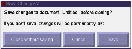
- class DialogSaveQuit(surf=None, flags=None, **kwargs)
Bases: sgc.widgets.dialog.Dialog
This dialog should be called when a user attempts to quit without saving. The dialog will remove itself if the user has cancelled the action.
- config(**kwargs)
Update widget configuration and redraw the widget.
- Keyword Args:
- pos: tuple (x,y) Position to set widget to.label: str Text to display next to widget.label_side: str (“top”, “right”, “bottom”, “left”)Which side of the widget to display the label.doc: str The file name of the current document.
- on_quit()
Called when the user clicks ‘close without saving’.
Emits an event with attribute ‘gui_type’ == “quit”.
Override this function to use as a callback handler.
- on_save()
Called when the user clicks the save button.
Emits an event with attribute ‘gui_type’ == “save”.
Override this function to use as a callback handler.
- on_close()
Called when the user cancels the action.
Emits an event with attribute ‘gui_type’ == “cancel”.
Override this function to use as a callback handler.